Thursday, 28 February 2013
Tuesday, 26 February 2013
QUESTION 4 (DRAFT)
How did you use media technologies in the construction and research, planning and evaluation stages?
- Tying to find the bands and artists was done through Facebook, Twitter and YouTube, becoming more of a tool for artists to distribute their work to thousands of people.
- Using the blogs was a main aspect of how I was able to communicate ideas to tutors for feedback and the accessibility of the blogs from any location means that work is not lost or only in one location.
Construction:
- Digital Cameras allowed us to film the footage succesfully and also take still images to use for the print production digipak. The raw footage was then compiled onto a laptop, which could then be edited. The use of the digital technology meant that we could review the footage and images on location to see if we needed to reshoot anything rather than having to wait until we got it back to a computer.
- The editing software we used was Final Cut Pro, an industry standard editing software on a Macbook, which enabled us to use advanced editing techniques to get the best out of our footage. We created the high saturation images within the video by manipulating the footage with exposure and saturation, but also used a filter on the de-saturated shots to create the contrast between the two shots; creating flashback or a change of time.
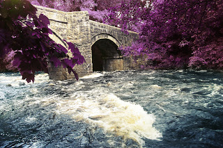
- The use of Photoshop and other photographic techniques enabled me to create the images within the digipak. Photographic techniques such as long shutter speeds enabled me to create the flowing river, adding to the dream-like mise-en-scene and motif within the digipak and video. Photoshop enabled me to create the contrast within the digipak of the bright shots on Panels 2 & 5 of the characters on a beach, against the high contrast, low saturation shots of them alone. The motif of purple trees was created by changing the hue of the greens within the images to a purple colour and correcting it with layer masks (TAKE PRINT SCREENS OF PHOTOSHOP WORK)
- New technologies offer a platform for amateurs and professionals to showcase their work together. Where a large company will show a trailor or music video, such as the VEVO franchise, on YouTube, a smaller, aspiring director or music producer will also showcase their work on YouTube to gain an audience. Aswell as social media, enabling people's creative outlet to be showcased online to thousands of people.
Research:
- The band's websites such as 'kankouran.bandcamp.com', and YouTube channels enabled us to find bands and get in contact with them. It helped us to find something that interested us so that we could promote it to the best of our ability.
- Similar texts, such as literature and film around the area of Lyme Regis and research of other music videos in the similar genre enabled us to create our own.
Planning:
- Stills camera to get shots of location and actors prior to shooting the video.
- DVD of French Lieutenants Woman to gain a further knowledge of the area and prior films/literature.
QUESTION 2 (DRAFT)
Ø French Lieutenants woman – The Cobb and the flowing clothes connotes the loss of love and unhappy character that is shown in the film. A more educated or aware demographic will understand the connotations of Lyme Regis and the surrounding area of Dorset and Devon with literature and film.
Ø Recurring motif of water and movement in water show change and the flow of life, enhancing to the meaning of the song, as Tarek Musa said, “Rivers for me personally is about life and death. Growing up, things changing. Nothing stays the same. Life is always changing, there is no certainty from day to day. That kinda vibe... it's also about sharing that with somebody; that whole experience...it's really a dark song, but it's been done in an uplifting way.” -Tarek Musa (Kankouran)
Ø ‘it's really a dark song’ – The song is about a dark and deep subject, but done in an uplifting way, therefore the juxtaposition of the dark imagery within the video and digipak contrast the song, but stay true to the meaning of the lyrics.
Ø Promotional package – eye catching motif of the purple trees is attractive to the consumer. Motif of purple, adds to the dream-like motif combined in both texts.
Ø Magazine: NME. An upcoming young band, trying to appeal to a young and new audience would be featured in a magazine like NME.
Ø Print productions link with music video due to the same characters being used in both, meaning the audience will make a connection between the two.
Monday, 25 February 2013
Digipak Editing
PANEL 1:
|
| Original |
 |
| PANEL 1 |
PANEL 2 & 5:
 |
| PANEL 2 PANEL 5 |
 |
| Original |
These two panels show the connection between the two characters in the music video, but because the panels will be pulled apart to open up to show panel 3 it also represents the de-connection of the two characters detailed in the video also.
PANEL 3:

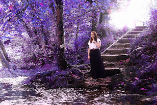
Throughout the three main panels (1, 3 & 6) I wanted to create a motif of a dream-like state to reflect the music video, as the music video shows very unsure and conflicted characters and a unrealistic motif also goes with that. I also wanted to create an eye-popping colour which would attract people's attention in the marketing sense of the product and purple trees are extremely ascetically pleasing and interesting so it would attract buyers. Also, linking to James Owen Fender's print production on 'The Cloud' where the colour cast on the image creates interest for the audience.
PANEL 4:
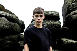
With this panel I wanted a complete contrast to Panel 5 as this panel will be on the back of Panel 5. This creates the sense of split and duality of the relationship and represents the two different sides to the character of 'Nile'.

PANEL 6:

Panel 6 also has the purple/dream-like motif to add to the unsure characters depth. I chose to have a picture of the female character, Ava, because she comes across as the most unsure and unsettled with the breakup and with Nile trying to find her so the last panel is an uneasy picture near a river, summing up the nature of her character nicely. With her touching her necklace it connects with the couple, as the necklace is a motif in the video, but also the location and colours make it seem dream-like, unreal and ethereal, especially with the bright light behind her.
Subscribe to:
Comments (Atom)


